


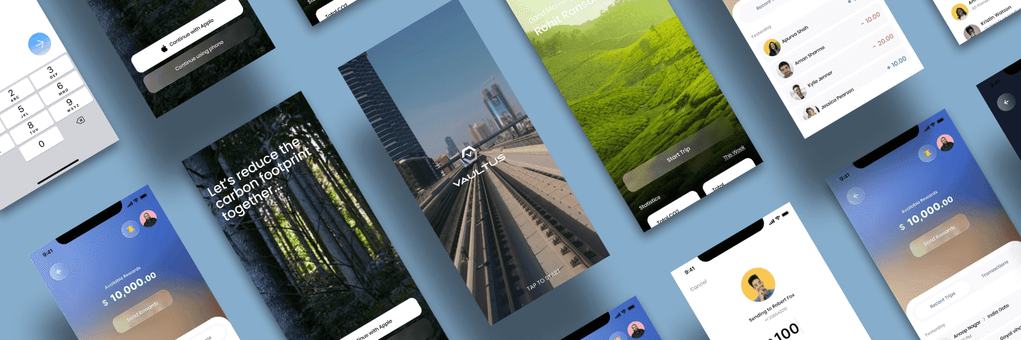
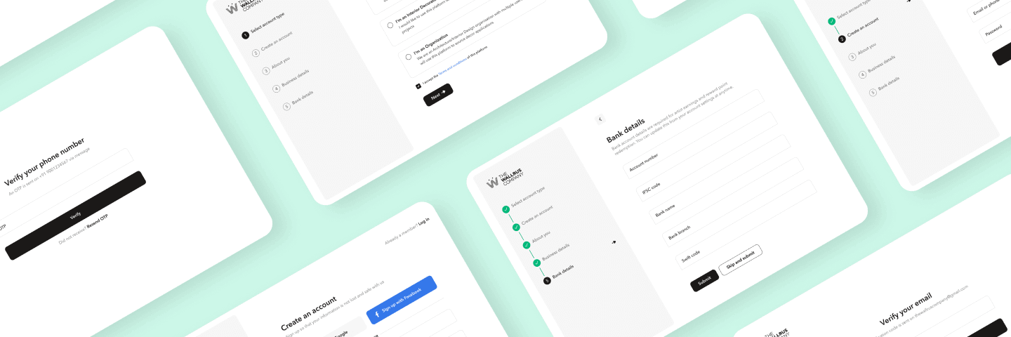
Discovery and research
We map who uses the product, what they are trying to do, and where the current experience fails them. Stakeholder interviews, competitive teardowns, and any analytics you already have set the direction before anyone opens Figma.


